Introduction
Having an AI chatbot on your website is a great conversational move. But do you care to think about its positioning? Well, you should, as the position of your chatbot determines how likely users are to notice and interact with it.
Excellent customer service, lead generation, appointment scheduling, or routine engagement can all be optimized by placing your chatbot where it gets the maximum eyes. The rest depends on how well you’ve trained your chatbot.
Now, you must be rethinking your chatbot’s position. Placing it in the lower-right corner of your page, the lower-left corner, or someplace else.
Well, no need to jog your brain further because, in this article, I will reveal the ideal positions for your AI chatbot.
Let’s follow the strategic approach to chatbot positioning and elevate customer interactions.
The ideal position for a Chatbot on a Website
Here are five ideal positions for placing a chatbot on a website. Also, follow the dos and don'ts for each position.

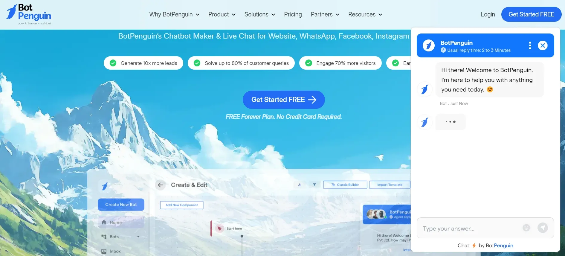
Bottom Right Corner (Floating Widget)
This position is popular because it is easily noticeable and accessible without obstructing the main content of the website. It allows users to interact with the chatbot while still being able to navigate the page.
- Dos: This is a commonly used and effective position for a chatbot. It is easily accessible and doesn't interrupt the user's browsing experience. Use a clear and concise message to grab attention and encourage users to interact with the bot.
- Don'ts: Avoid intrusive pop-ups or excessive animation that might annoy users. Ensure that the chatbot widget doesn't cover essential content or obstruct important elements on the page.
Embedded in the Bottom Corner (Static Widget)
Placing the chatbot in the bottom corner provides a less obtrusive position while still being visible to users. It integrates well with the website design and offers a persistent option for users to initiate a conversation.
- Dos: Place the chatbot icon in the bottom corner, making it visible but less obtrusive. Design the icon to match the theme and branding of the website for better integration. Use informative tooltips or labels to provide context about the chatbot's functionality.
- Don'ts: Avoid making the chatbot icon too small or inconspicuous, as users may struggle to notice it. Additionally, don't overload the icon with unnecessary animation or distracting elements.
Suggested Reading:How can a Chatbot Improve Customer Experience on Your E-Commerce Website
In the Header or Navigation Menu

Placing the chatbot in the header or navigation menu ensures its prominence and visibility to users. It makes the chatbot easily accessible from any page, providing convenient assistance during the user's entire browsing journey.
- Dos: Embed the chatbot in the header or navigation menu for prominent visibility. This position ensures easy access and encourages users to engage with the bot. Use a clear call-to-action to prompt users to start a conversation.
- Don'ts: Be cautious not to overcrowd the header or navigation menu with too many elements, which might confuse users. Avoid placing the chatbot in a location where it obscures essential navigation options.
On the Contact or Support Page
By placing the chatbot on the contact or support page, users can quickly access assistance when needed. It streamlines the support process and eliminates the need for users to search for contact information or fill out complex forms.
- Dos: Display the chatbot on the contact or support page to provide instant assistance and streamline customer inquiries. Use personalized greetings to make users feel welcome and offer relevant help options.
- Don'ts: Don't bury the chatbot within a maze of information or hide it on a secondary page. Ensure that it is easy to find and accessible to users needing assistance while exploring the website.
Suggested Reading:
Triggered by Exit Intent
Placing a chatbot with exit intent triggers helps retain users about to leave the website. By engaging them with an offer or assistance, you can potentially change their decision and encourage them to explore further or provide valuable feedback.
- Dos: Implement an exit intent trigger that activates the chatbot when a user is about to leave the website. Use a friendly message to offer help, discounts, or incentives to encourage users to stay or provide feedback before they leave.
- Don'ts: Avoid using this position as the primary chatbot placement, as it may not address user needs comprehensively. Ensure that the chatbot doesn't interrupt the user's flow or become intrusive, as some users may find exit intent triggers annoying.
Remember, the ideal position for a chatbot may vary based on your website's layout and user behavior. Regularly monitor and analyze user interaction to determine which position yields the best results. Additionally, always prioritize user experience and ensure that the chatbot placement enhances, rather than hinders, the browsing experience.
Conclusion
In conclusion, the position of a chatbot on a website plays a crucial role in its effectiveness.
By strategically placing the chatbot in the bottom right corner, embedded in the bottom corner, in the header or navigation menu, on the contact or support page, or triggered by exit intent, you can maximize its visibility and accessibility to users.
However, it's important to follow the dos and don'ts for each position to ensure a seamless user experience. Regularly analyze user interaction to determine which position works best for your website.
Remember to prioritize user experience and ensure the chatbot placement enhances the browsing experience.
Suggested Reading:
Frequently Asked Questions (FAQs)
Why is the bottom right corner a popular position for a chatbot?
The bottom right corner is easily noticeable and accessible without obstructing the main content of the website.
How should I design the chatbot icon in the bottom corner?
Design the icon to be visible but less obtrusive, matching the theme and branding of the website.
What is the advantage of placing the chatbot in the header or navigation menu?
Placing the chatbot in the header or navigation menu ensures its prominence and visibility on any page, providing convenient assistance during browsing.
Why is placing the chatbot on the contact or support page beneficial?
Placing the chatbot on the contact or support page allows users to access assistance when needed, streamlining the support process quickly.
How can a chatbot triggered by exit intent be useful?
A chatbot triggered by exit intent can help retain users about to leave the website by engaging them with offers or assistance, potentially changing their decision to leave.


