![Best Email Capture Examples for 2025 [with Conversion Tips].webp](https://relinns-hrm.s3.ap-south-1.amazonaws.com/uploads/1747041245730_Best Email Capture Examples for 2025 [with Conversion Tips].webp)
You’ve got traffic. But barely anyone signs up.
That’s the frustration most businesses face in 2025—when attention is fleeting, and inboxes are crowded.
But here’s what hasn’t changed: Email still converts. In fact, for every $1 spent, email marketing delivers a $42 return (DMA, 2025). No social trend, ad hack, or TikTok dance has beaten that.
And yet…
Collecting emails isn’t enough anymore.
You need to earn them. You need a smarter strategy—one that speaks to real people, in real time, and builds real trust.
That’s where this blog comes in.
We’re diving into the best email capture examples of 2025— the psychological triggers, design principles, and chatbot-powered tactics that turn casual visitors into loyal subscribers.
What Makes an Email Capture Work?
Not every email capture form gets results. The ones that do are designed with intent. They use simple techniques that guide people to take action—without pressure or confusion.
Below are key elements that improve how well your form (or chatbot) performs.
1. Start with Small Steps (Micro-Commitments)
Asking someone to fill out a long form right away often doesn’t work. But asking one simple question? That’s much easier.
For example, you can begin by asking:
- “Would you like a quick guide to improve your marketing?”
- “Looking for personalized suggestions?”
Once they say yes, you continue the conversation.
2. Create a Reason to Act Now (Urgency and Scarcity)
People tend to delay unless they have a reason to act sooner.
You can encourage quicker decisions by highlighting:
- Limited-time offers
- Low availability
- Early access opportunities
✅ Example: “Free setup call—only available for the first 10 signups this week.”
This helps users prioritize their next step.
3. Offer Something of Value First (Exchange for Email)
Before asking for an email, offer something useful.
It could be:
- A free PDF guide
- A discount code
- A personalized checklist
- Access to a resource library
✅ You can deliver this offer through the chat, then simply ask where to send it. The value comes first—the email follows naturally.
4. Show You Can Be Trusted (Authority and Proof)
Most people want to know who they’re giving their information to. Sharing proof builds trust:
- Show how many others have signed up
- Mention well-known clients or results
- Add logos, ratings, or testimonials
5. Make It Feel Personal (Community and Belonging)
Many users don’t want to just “sign up.” They want to be part of something.
Instead of saying, “Subscribe to our newsletter,” try:
- “Join 5,000+ small business owners getting weekly tips.”
- “Be part of our founder community.”
✅ Positioning your email list this way makes it feel like joining a helpful network, not just receiving more emails.
Best Email Capture Examples
Real success leaves clues. If you want to master email captures in 2025, study the brands already crushing it.
Here are winning email capture examples, broken down by strategy, so you can grab what fits your audience best.
From scarcity-driven offers to gamified quizzes and sleek one-field forms, today’s best brands are turning email signups into meaningful micro-experiences.
Whether you want to build urgency, offer instant value, or simply remove friction, there’s a proven tactic here for every style.
Let’s break down some of the smartest approaches—by category and by brand.
Scarcity and Urgency Driven Forms
Scarcity taps into human FOMO (fear of missing out).
When used well, urgency-based forms drive people to act fast—without feeling tricked.
💄 Glossier – “Enjoy 15% Off” Welcome Offer
Glossier is a beauty brand loved for its minimalist products and community-first marketing approach. They focus heavily on clean design and digital-first experiences.
Where it appears:
Upon visiting Glossier's website, a popup emerges, offering a 15% discount on the first purchase.
What it says:
- “Enjoy 15% off”
- “Enter your email to receive 15% off your first order.”
- A field to input your email address and a button labeled “Claim 15% off”(Glossier)
Why it works:
- Immediate Value: Offering a tangible benefit (15% off) right away incentivizes users to subscribe.
- Clear Messaging: The offer is straightforward, eliminating any ambiguity.
- Brand Consistency: The popup design aligns with Glossier's minimalist aesthetic, ensuring a seamless user experience.
What you can learn:
- Offer Immediate Incentives: Providing a discount or exclusive content can significantly boost email signups.
- Maintain Clarity: Ensure your message is concise and easily understandable.
- Align with Brand Identity: Your email capture forms should reflect your brand's look and feel for consistency.
By integrating such strategies, you can enhance user engagement and grow your email list effectively. If you'd like, I can also provide a detailed breakdown of Huckberry's email capture approach.
Huckberry – “Get Free Shipping” Newsletter Signup
.webp)
Huckberry is an adventure-focused lifestyle brand known for rugged fashion, gear, and a storytelling approach that deeply connects with outdoor enthusiasts.
Where it appears:
Upon visiting Huckberry's website, a popup emerges, inviting users to subscribe to their newsletter in exchange for free shipping on their first order.
What it says:
- “Sign up for our newsletter and get free shipping today.”
- “You'll also receive the coolest gear, inspirational stories, and a hell of a lot more delivered straight to your inbox.”
- A field to input your email address and a button labeled “Subscribe”
Why it works:
- Immediate Benefit: Offering free shipping provides an instant incentive for users to subscribe.
- Value-Added Content: Beyond the immediate benefit, subscribers are promised engaging content, enhancing the perceived value.
- Simplicity: The form is straightforward, requiring only an email address, reducing friction in the signup process.
What you can learn:
- Offer Tangible Incentives: Providing immediate, tangible benefits like free shipping can significantly boost subscription rates.
- Highlight Additional Value: Emphasize the ongoing value subscribers will receive, such as exclusive content or early access to products.
- Keep It Simple: Minimize the information required to subscribe, making the process quick and easy.
This conversational approach can make the signup process feel more personal and engaging, potentially increasing conversion rates.
By integrating such strategies, you can enhance user engagement and grow your email list effectively. If you'd like, I can also provide a detailed breakdown of other brands' email capture approaches.
Value-First Lead Magnet Forms
These forms focus on giving value before asking for anything. Instead of just asking users to “subscribe,” brands offer something helpful—like a free guide, template, or checklist.
This approach builds trust and makes people more likely to share their email.
HubSpot – Free Marketing Templates Download
HubSpot is a global leader in CRM, marketing automation, and inbound marketing.
Known for offering high-quality free tools and educational content, they’ve built a reputation for helping businesses grow—especially through smart, non-intrusive lead generation strategies.
Where it appears:
On educational blog posts, resource hubs, and landing pages related to digital marketing. The email capture form often appears mid-article or in a sidebar, offering free downloads in exchange for contact details.
What it says:
- “Get 50 Free Marketing Templates”
- “Download ready-to-use templates for emails, social media, and campaigns. Just enter your email to get started.”
- A short form asking for name and email, and a CTA like “Download Now”
Why it works:
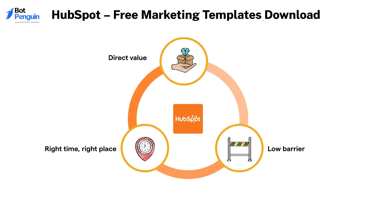
- Direct value: The templates solve a common problem—creating quality marketing content from scratch.
- Low barrier: The form is short and easy to complete.
- Right time, right place: The offer shows up when the reader is already thinking about marketing strategies, making it feel helpful rather than random.
What you can learn:
- Create a useful resource that’s quick to apply—like a checklist, worksheet, or toolkit.
- Use clear language that explains exactly what the user will receive.
- Place your form where it naturally fits the reader’s journey (e.g., after a tip or strategy).
Neil Patel – Free SEO Checklist Download
Neil Patel is a renowned digital marketing expert and entrepreneur, co-founder of NP Digital.
Recognized by Forbes and The Wall Street Journal, he has assisted major companies like Amazon and Microsoft in enhancing their online presence.
Through his website, Neil offers a wealth of free tools, resources, and insights to help businesses and marketers improve their digital strategies.
Where it appears:
On his blog and resource pages, particularly those discussing SEO strategies and tips.
The email capture form is typically embedded within the content or presented as a popup, offering the SEO checklist as a downloadable resource.
What it says:
- “Download the Ultimate SEO Checklist”
- “Get a step-by-step guide to optimize your website and improve your rankings. Enter your email to receive the checklist.”
- A simple form requesting the user's email address, followed by a CTA button like “Send Me the Checklist”
Why it works:
- Immediate Value: The checklist provides actionable steps that users can implement right away to enhance their SEO efforts.
- Expert Authority: Given Neil Patel's reputation in the digital marketing space, users trust the quality and effectiveness of the resource.
- Simplicity: The form is straightforward, requiring minimal information, which reduces friction and encourages sign-ups.
What you can learn:
- Offer Practical Resources: Provide tools or guides that address specific challenges your audience faces.
- Leverage Credibility: If you or your brand have expertise in a particular area, highlight this to build trust.
- Keep Forms Simple: Request only essential information to lower barriers to entry.
Authority and Proof-Based Captures
These forms build trust by showcasing credibility—using elements like user numbers, trusted logos, or success stories.
This strategy helps new visitors feel confident about signing up.
Shopify
Shopify is a leading global e-commerce platform, empowering millions of entrepreneurs and businesses to create and manage online stores.
Renowned for its user-friendly interface and robust features, Shopify emphasizes simplicity and trust in its user interactions.
Where it appears:
On their free trial landing page, Shopify presents a clean and straightforward email capture form, inviting users to start their e-commerce journey.
What it says:
- “Start your free trial”
- “Try Shopify free for 3 days, no credit card required.”
- A single field to enter your email address.
- CTA button: “Start free trial”
Why it works:
- Simplicity: The form is uncluttered, focusing solely on the essential information, which reduces friction and encourages sign-ups.
- Trust Signals: By stating "no credit card required," Shopify alleviates concerns about hidden charges, building trust with potential users.
- Brand Consistency: The minimalist design aligns with Shopify's overall branding, providing a cohesive user experience.
What you can learn:
- Keep it Simple: A straightforward form with minimal fields can increase conversion rates.
- Build Trust: Clearly communicate any free offers or trials without hidden conditions to establish credibility.
- Consistent Branding: Ensure your forms align with your brand's look and feel for a seamless user experience.(Avada)
By adopting Shopify's minimalist and trust-focused email capture strategy, you can effectively encourage sign-ups and build a reliable user base.
Trello – Client Logo Authority Capture
Trello is a visual collaboration tool that helps teams organize tasks and projects using boards, lists, and cards.
It's widely used by businesses of all sizes for project management, content planning, and more.
Where it appears:
On Trello's homepage and landing pages, often near call-to-action buttons or sign-up forms.
What it says:
- Displays logos of well-known companies that use Trello, such as Google, Pinterest, and Fender.
- Accompanied by a prompt like “Join millions of users who trust Trello to manage their projects.”
- A simple sign-up form requesting an email address.
Why it works:
- Social Proof: Seeing familiar company logos builds trust and suggests reliability.
- Simplicity: The form is straightforward, reducing friction for the user.
- Credibility: Highlighting well-known clients implies that Trello is a reputable and effective tool.
What you can learn:
- Showcase Recognizable Clients: Displaying logos of reputable clients can enhance credibility.
- Keep Forms Simple: Request only essential information to encourage more sign-ups.
- Use Trust Signals: Incorporate elements that convey reliability and authority.
By integrating authority elements into your email capture strategy, you can build trust and encourage more users to engage with your brand.
Gamified and Interactive Captures
Gamified email captures engage users by incorporating interactive elements like quizzes, games, or challenges.
These methods not only entertain but also encourage users to share their information in exchange for personalized results or rewards.
Death Wish Coffee – “Find My Brew” Quiz Funnel
Death Wish Coffee is renowned for producing the “World’s Strongest Coffee.” With a bold brand identity, they cater to coffee enthusiasts seeking high-caffeine blends.
Where it appears:
On their website's dedicated quiz page.
What it says:
- “Take this quiz to find out which of our everyday roasts is best for you.”
- A series of questions about taste preferences and caffeine tolerance.
- Email capture prompt before revealing personalized coffee recommendations.
Why it works:
- Personalization: Users receive coffee suggestions tailored to their preferences.
- Engagement: The quiz format is interactive and fun.
- Data Collection: Captures user emails and preferences for targeted marketing.
What you can learn:
- Interactive Tools: Quizzes can effectively engage users and collect valuable data.
- Value Exchange: Offering personalized results encourages users to share their information.
- Brand Alignment: Ensure the interactive element aligns with your brand's identity.
Beardbrand – “What Type of Beardsman Are You?” Quiz
Beardbrand specializes in grooming products for men, focusing on beard care. They aim to foster confidence through grooming.
Where it appears:
On their homepage and dedicated quiz landing pages.
What it says:
- “What type of beardsman are you?”
- A series of lifestyle and grooming questions.
- Email capture prompt before revealing personalized grooming tips and product recommendations.
Why it works:
- Engagement: The quiz is entertaining and resonates with the target audience.
- Personalization: Provides tailored grooming advice and product suggestions.
- Lead Generation: Effectively captures emails for future marketing efforts.
What you can learn:
- Audience Understanding: Craft quizzes that reflect your audience's interests and lifestyle.
- Personalized Marketing: Use quiz results to tailor product recommendations.
- Effective Lead Capture: Interactive content can be a powerful tool for collecting user information.
By incorporating gamified elements like quizzes into your email capture strategy, you can enhance user engagement, collect valuable data, and provide personalized experiences that resonate with your audience.
Community and Identity-Driven Captures
These strategies focus on building a sense of belonging and shared identity. By aligning with users' values and fostering a community, brands encourage users to subscribe and engage more deeply.
Calm – Top Banner Offer with Social Proof
Calm is a leading meditation and sleep app designed to help users reduce stress, improve sleep quality, and enhance overall well-being.
With over 2 million 5-star reviews, it's trusted by individuals seeking mental wellness support.
About the Brand:
Calm is a leading meditation and sleep app designed to help users reduce stress, improve sleep quality, and enhance overall well-being.
With over 2 million 5-star reviews, it's trusted by individuals seeking mental wellness support.
Where it appears:
On Calm's homepage, a prominent banner at the top offers users a special promotion, such as a discounted annual subscription.
To access the offer, users are prompted to enter their email address.
What it says:
- “Limited Time Offer: Get 50% off Calm Premium.”
- “Join millions experiencing better sleep, lower stress, and less anxiety.”
- A simple form requesting the user's email to unlock the offer.
Why it works:
- Immediate Value: The discount provides a tangible incentive for users to subscribe.
- Social Proof: Highlighting the vast user base builds trust and credibility.
- Simplicity: The straightforward form minimizes friction in the sign-up process.
What you can learn:
- Leverage Promotions: Offering time-sensitive deals can prompt quick action.
- Highlight Community: Emphasizing a large, satisfied user base can enhance credibility.
- Keep It Simple: A minimalistic approach can reduce barriers to entry.
Morning Brew – Viral Referral Program
Morning Brew is a daily email newsletter delivering the latest business news in a witty and concise format, targeting young professionals.
It's known for its engaging content and rapid subscriber growth.
Where it appears:
At the end of each newsletter and on a dedicated referral page, Morning Brew encourages readers to refer friends in exchange for rewards.
What it says:
- “Share Morning Brew with your friends, earn exclusive rewards.”
- A personalized referral link and a dashboard showing referral progress.
- A tiered reward system offering swag like stickers, mugs, fun hoodies, and t-shirts based on the number of referrals.
Why it works:
- Gamification: The tiered rewards create a fun and competitive environment.
- Community Building: Encouraging readers to share the newsletter fosters a sense of belonging.
- Personalization: Customized referral links and progress tracking enhance user engagement.
What you can learn:
- Incentivize Sharing: Offering rewards can motivate users to promote your brand.
- Build a Community: Encouraging user referrals can create a network of engaged subscribers.
- Track Progress: Providing users with tools to monitor their referral success can boost motivation.
By integrating community-driven strategies and leveraging social proof, both Calm and Morning Brew effectively encourage users to subscribe and engage with their brands. Implementing similar tactics can help foster a loyal and active user base.
Minimalist Frictionless Captures
These strategies prioritize simplicity and ease of use, ensuring users can sign up or provide information with minimal effort.
By reducing the number of required fields and streamlining the process, brands can increase conversion rates and enhance user experience.
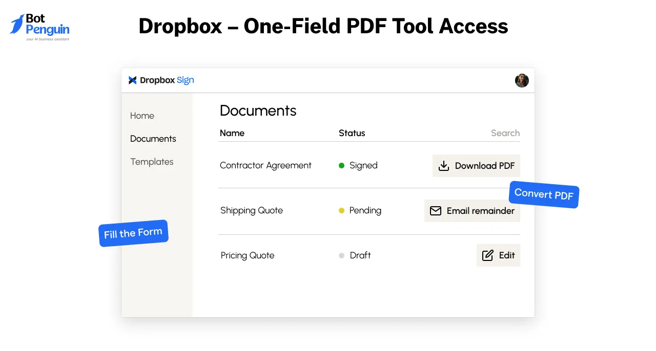
Dropbox – One-Field PDF Tool Access
Dropbox is a cloud-based file storage and collaboration platform that allows users to store, share, and manage files seamlessly.
It's widely used by individuals and businesses for its user-friendly interface and robust features.
Where it appears:
On the Dropbox Resources page, particularly when accessing tools like "Turn a PDF into a fillable form."
What it says:
- “Convert your PDFs into fillable forms effortlessly.”
- A single field requesting the user's email address to access the tool.
Why it works:
- Simplicity: Only one field to fill out reduces friction.
- Immediate Value: Users gain access to a useful tool instantly.
- Trust: Dropbox's reputation assures users of the tool's reliability.
What you can learn:
- Minimize Fields: Ask only for essential information to lower barriers to entry.
- Highlight Value: Clearly communicate the benefit users will receive.
- Leverage Brand Trust: A reputable brand can enhance user confidence in providing information.
Airtable – Fast Signup Form
Airtable is a cloud-based collaboration platform that combines the features of a database with a user-friendly spreadsheet interface.
It's used for project management, content planning, and more.
Where it appears:
On Airtable's homepage and sign-up pages.
What it says:
- “Create your free account.”
- A simple form requesting only the user's email address.
Why it works:
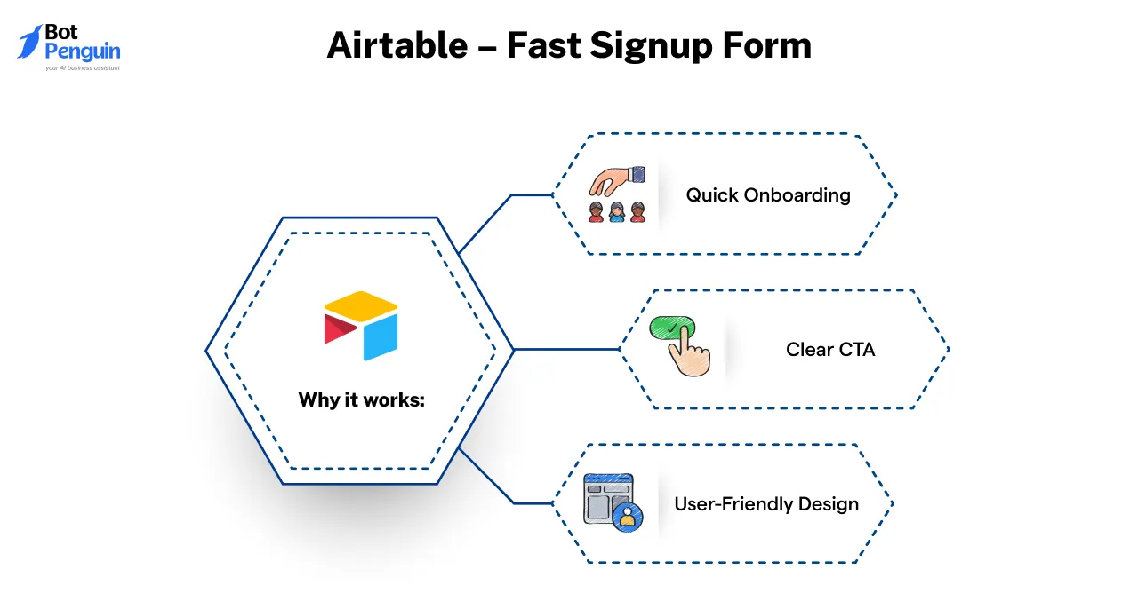
- Quick Onboarding: Users can start immediately without filling out lengthy forms.
- Clear CTA: The call-to-action is straightforward and compelling.
- User-Friendly Design: The clean interface enhances the user experience.
What you can learn:
- Streamline Sign-Up: Reduce the number of steps to get users started quickly.
- Clear Messaging: Ensure your call-to-action is direct and easy to understand.
- Design Matters: A clean, uncluttered design can improve user engagement.
By adopting minimalist and frictionless email capture strategies like those of Dropbox and Airtable, you can enhance user experience and boost conversion rates.
Conversational Chatbot Captures for B2B
In the B2B landscape, chatbots serve as dynamic tools to engage visitors, qualify leads, and capture essential information like email addresses.
By simulating natural conversations, they provide personalized experiences, answer queries, and guide prospects through the sales funnel without immediate human intervention.
MongoDB – Lead Qualification via Conversational Chatbot
MongoDB is a leading NoSQL database platform that enables developers to build scalable and flexible applications.
Where it appears:
On MongoDB's website, particularly on pages targeting potential clients interested in their database solutions.
What it says:
- “Hi there! Looking to scale your application with MongoDB?”
- “Can I get your email to send you a personalized demo?”
Why it works:
- Personalized Engagement: The chatbot initiates a conversation based on the visitor's interests.
- Efficient Lead Capture: By requesting an email early in the conversation, it streamlines the lead generation process.
- Resource Sharing: Offers relevant resources post-email capture, enhancing value.
What you can learn:
- Early Email Capture: Requesting contact information early can be effective if value is immediately provided.
- Tailored Conversations: Personalizing chatbot interactions increases engagement and trust.
- Resource Integration: Sharing relevant materials post-capture can nurture leads effectively.
Adobe – Event Registration Chatbot
Adobe is a multinational software company known for its creative and multimedia products, including Photoshop, Illustrator, and Adobe Experience Cloud.
Where it appears:
On Adobe's event landing pages, particularly for webinars and virtual conferences.
What it says:
- “Welcome! Interested in our upcoming Adobe Experience webinar?”
- “Please provide your email to reserve your spot.”
Why it works:
- Immediate Value Proposition: Clearly states the benefit of registering.
- Simplicity: A straightforward request for an email makes the process quick.
- Automated Confirmation: Sends a confirmation email with event details instantly.
What you can learn:
- Clear Call-to-Action: Directly stating the purpose of the email capture increases conversions.
- Efficiency: Automating confirmations enhances user experience.
- Event Promotion: Chatbots can effectively drive event registrations.
These examples illustrate how B2B companies can utlize chatbots to efficiently capture emails and engage users.
By providing immediate value and maintaining straightforward interactions, chatbots can significantly enhance lead generation efforts.
Common Mistakes to Avoid in Email Capture Forms
Even a great email capture idea can fail if the form itself causes friction. A few small missteps—like asking for too much or showing the form too soon—can make visitors bounce before they ever type their email.
Here are the most common mistakes that quietly hurt your conversions—and how you can fix them fast.
1. Asking for Too Much, Too Soon
The more you ask upfront, the more users hesitate. Forms that request full names, job titles, phone numbers, or company size right away feel like too much work—or worse, a trap.
Real-world insight: Forms with three fields or fewer convert about 25% better than longer ones (Unbounce, 2025).
✅ Try this instead: Start simple. Ask for a name and email—just enough to begin the relationship. You can always learn more later as trust grows.
2. Showing the Form at the Wrong Time
Pop-ups that appear the second someone lands on your site feel interruptive. If users haven’t had a chance to look around yet, they’re more likely to close it—or leave completely.
Smarter timing in action: Brands like Canva delay their email pop-ups until the user has scrolled or spent some time browsing. This shows respect for the user’s experience—and builds trust.
✅ Try this instead:
Use smart triggers:
- Scroll-based (after 50% page scroll)
- Time-based (after 10+ seconds)
- Exit-intent (when the cursor moves toward the browser bar)
These let you ask at the right moment—not the random one.
3. Offering No Clear Value
“Sign up for our newsletter” doesn’t excite anyone anymore. People need a clear reason to subscribe—something useful, relevant, or exclusive.
🔍 What works better: Brands that offer value—like a free guide, discount code, or insider access—see twice as many signups (HubSpot, 2025).
✅ Try this instead:
Tell them what they’ll get, and why it matters:
- “Get 15% off your first order”
- “Download our free checklist for better productivity”
- “Be the first to know about product launches”
The more specific, the better.
4. Forgetting About Mobile Users
A form that looks great on desktop might be broken, squished, or unreadable on mobile. And since most users visit from their phones, poor mobile design quietly kills your conversions.
Who’s doing it right:
Zara’s mobile email captures are smooth: tap-friendly buttons, clean design, and fast loading. No pinching or zooming needed.
✅ Try this instead:
- Use large input fields and buttons
- Keep text short and readable
- Test your form on actual mobile devices—not just previews
Quick Recap
Emerging Trends in Email Capture (2025 & Beyond)
Email capture in 2025 looks a lot different than it did just a couple of years ago. It’s no longer about tossing up a popup and hoping people type in their email. I
t’s about trust, timing, and meeting people where they are—with experiences that feel less like forms and more like conversations.
Here’s what smart brands are doing now:
1. Smarter Forms, Thanks to AI
Forget static forms that show the same message to everyone. AI-powered forms are learning as they go—adjusting based on what users do.
For example:
- First-time visitor? Show a warm welcome offer.
- Already poking around the pricing page? A subtle discount might appear.
- Scrolling quickly? The form waits until they slow down.
It’s all about reading the room and responding in real time. Brands using this approach are seeing a serious boost in signups—sometimes up to 30% more.
2. Agents That Capture Emails Mid-Conversation
Instead of saying, “Enter your email,” an Agent casually asks, “Want me to send you a quick checklist?”
The user says yes, types in their email—and just like that, the connection’s made.
It feels more natural, especially on mobile. It works great for businesses offering demos, audits, or helpful resources. And it’s already being used by consultants, real estate pros, and DTC brands who want to keep things light and helpful—not pushy.
3. Voice-Activated Email Signups Are Starting to Show Up
As voice assistants become more common, some brands are experimenting with voice-triggered email capture.
Picture this: You’re browsing on your phone and a prompt says, “Want today’s tips sent to your inbox?” You just say “Yes,” and then speak your email aloud.
That’s it—no typing required.
It’s especially handy when users are multitasking or on the move. Early data shows voice signups are pulling in more engagement than traditional popups, especially on mobile.
BotPenguin is already on its way of voice agents which will enable this functionality
4. Clear, Honest Opt-Ins That Build Trust
In a world of privacy concerns and inbox overload, people want to know exactly what they’re signing up for.
That means:
- Saying what they’ll get and how often
- Making privacy info easy to find
- Giving them control over marketing preferences
And it works. Brands that lead with clarity are seeing more loyal subscribers and lower churn. Transparency isn’t just a legal box to tick—it’s a conversion booster.
Email capture today is less about collecting addresses and more about creating moments. Whether it’s an AI-powered form, a helpful Agent, or a voice prompt, the best experiences feel thoughtful—not forced.
If you’re looking to grow your list in 2025, make it feel like a conversation—not a transaction.
Conclusion
Building an email list is all about creating connections. In 2025, the brands that win are the ones who know how to offer value, build trust, and meet users where they are—whether it’s through a quiz, a chatbot, or a perfectly-timed popup.
From value-first lead magnets to AI-driven chat flows, email capture is no longer just a box on a page. It’s a conversation. A micro-experience. A moment of genuine exchange.
And that’s exactly where BotPenguin comes in.
BotPenguin helps you go beyond traditional forms by turning everyday interactions into high-converting conversations.
Whether you're a startup, agency, or B2B platform, BotPenguin lets you create chatbot-driven email captures that feel personal, natural, and effective—no code needed.
So if you're ready to stop interrupting and start engaging, it’s time to modernize your approach.
Let your next email subscriber come from a conversation, not just a click. Start building smarter with BotPenguin—your AI-powered growth partner.
Frequently Asked Questions (FAQs)
Should I use popups or inline forms?
Both work when used smartly. Popups grab instant attention, while inline forms blend into the journey.
The best email capture examples often use a mix of both based on timing.
How many fields should an email capture form have?
Keep it simple—one to two fields max. The highest-converting email capture examples only ask for essentials like name and email, minimizing friction and boosting signup rates effortlessly 📧.
Is double opt-in better than single opt-in?
Double opt-in ensures higher quality lists but may lower signups. Many email capture examples prefer it because it builds trust, reduces fake entries, and keeps engagement rates stronger over time.
What’s a good conversion rate for email captures?
A strong benchmark for email capture examples is 3% to 5%.
Top-performing brands push even higher with optimized offers, strong CTAs, and mobile-first, frictionless designs built for today's user habits.
How can BotPenguin help with email capture?
BotPenguin lets you build an AI-driven conversational agent that captures emails without coding.
You create engaging, human-like experiences that collect emails naturally, boosting signups and building lasting customer relationships faster.