What is a CTA?

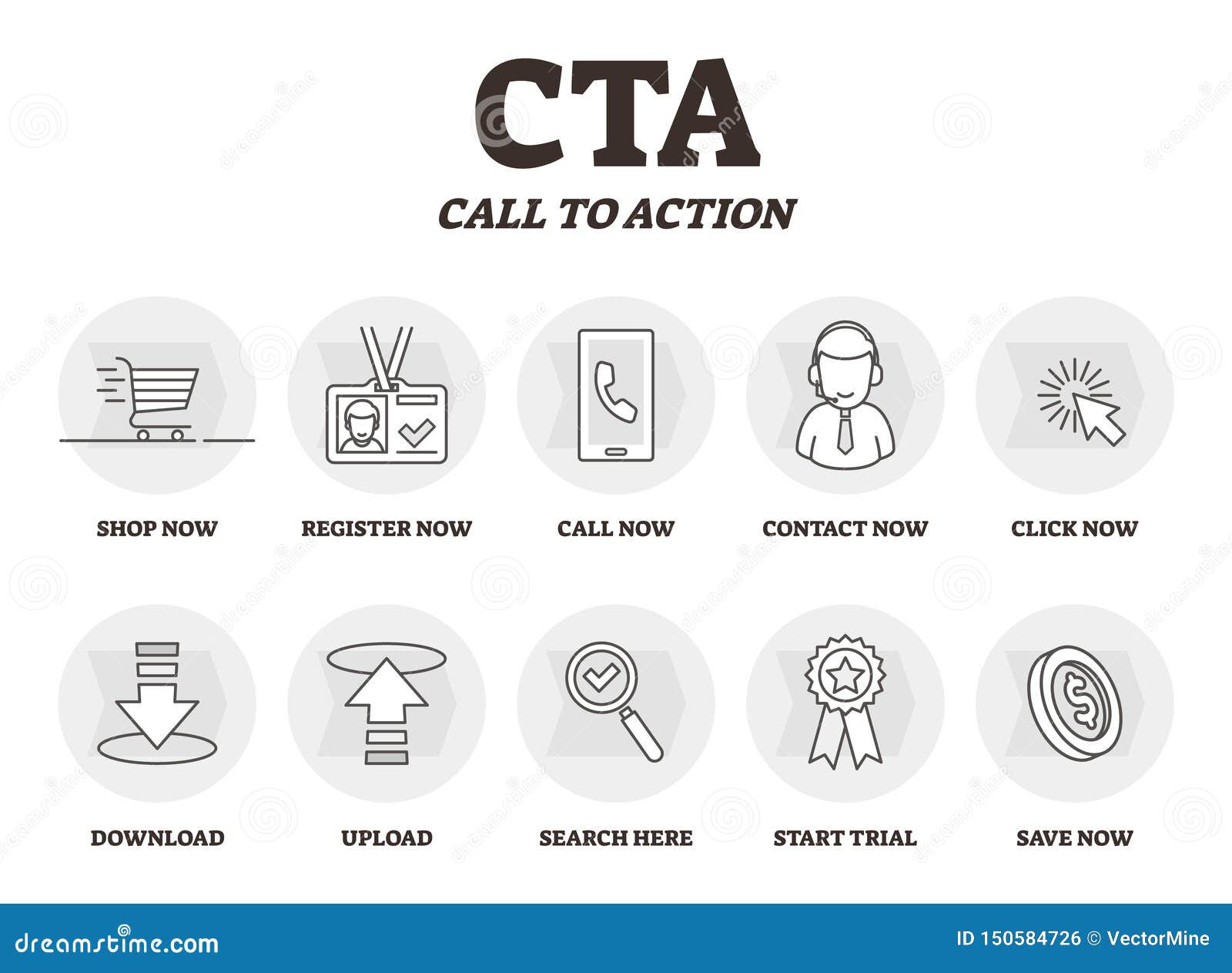
A call to action (CTA) is crucial to any website or marketing campaign. It is an invitation for your audience to take a specific action, such as making a purchase, subscribing to a newsletter, or filling out a contact form. CTAs can handle many forms, including buttons, links, or even images, and they play a critical role in driving conversions and achieving your marketing goals.
Examples of CTAs include:
- Sign up now
- Subscribe to our newsletter
- Download our free ebook
- Buy now
- Learn more
- Contact us
CTAs can come in different formats, such as text links, buttons, images, or videos. They can be placed on a webpage or within an email, such as in the header, sidebar, or at the end of a blog post.
The design and placement of the CTA can impact its effectiveness, so it's essential to consider the user experience and make the CTA as prominent and appealing as possible.
Types of CTAs include:
When it comes to calls to action (CTAs), there are different types that you can use depending on the goal of your campaign or the specific action you want your audience to take. Here are the most common types of CTAs:

Primary CTA
A primary CTA is the main action you want your audience to take. It's typically placed prominently on your website or landing page and is designed to be the most visible and attention-grabbing CTA.
Examples of primary CTAs include Buy Now, Sign Up, or Learn More.
Secondary CTA
A secondary CTA is a backup option for users not ready to take immediate action. It's typically less prominent than the direct CTA and is designed to offer an alternative or less committal action.
Examples of secondary CTAs include Download a Free Trial, Watching a Demo, or Read Our Blog.
Specialty CTA
A specialty CTA is a type of CTA that's designed for a specific purpose or audience. It's typically used in campaigns with a particular goal or target audience.
Examples of specialty CTAs include Get My Free Ebook, Join Our VIP List, or Register for a Webinar.
Social Media CTA
A social media CTA is a type of CTA that's explicitly designed for social media platforms. It's typically used to encourage users to engage with your brand on social media by liking, commenting, or sharing your content.
Examples of social media CTAs include Follow Us on Twitter, Join the Conversation, or Share This Post.
Exit Intent CTA
An exit intent CTA is a type of CTA that's designed to capture the attention of users who are about to leave your website or landing page.
It's typically triggered when a user moves their cursor toward the top of the page, indicating that they will close the window.
Examples of exit intent CTAs include Wait, Don't Leave Yet! or Get Our Exclusive Offer Before You Go.
Slide-In CTA
A slide-in CTA is a type of CTA that's designed to slide into view as a user scrolls down the page. It's typically less intrusive than other types of CTAs and is intended to be less disruptive to the user experience.
Examples of slide-in CTAs include Subscribe to Our Newsletter, Get Our Latest Updates, or Join Our Community.
Pop-Up CTA
A pop-up CTA is a type of CTA that's designed to appear in a separate window or tab when a user clicks on a button or link. It's typically more intrusive than other types of CTAs but can effectively capture users' attention who might otherwise ignore different types of CTAs.
Examples of pop-up CTAs include Get Our Exclusive Offer, Join Our Loyalty Program, or Get Our Free Guide.
Best practices for creating effective calls to action:
- Use Action-Oriented Language: Use action-oriented language to clarify what action you want the user to take. Use active verbs and phrases encouraging users to take immediate action, such as Download or Sign up today.
- Make it Prominent: Make the call to action prominent on the page so that it's easy for users to find. Use a larger font size or a contrasting color to make it stand out. Place the CTA above the fold, or in other words, make sure it is visible without having to scroll down the page.
- Create Urgency: Use language that creates a sense of urgency, such as Limited time offer or Only a few spots left. This can motivate users to take immediate action rather than putting it off.
- Keep it Simple: Keep the CTA simple. Use clear and concise language that makes it easy for users to understand what action they need to take. Avoid using jargon or complex language that might confuse the user.
- Test Different Variations(A/B Test): Test different variations of your CTA to see which ones are most effective. Experiment with different colors, fonts, and wording to find the best combination for your audience.
In addition to these tips, the placement, color, and size of the call to action can also impact its effectiveness.
For example, contrasting colors with the page's rest can help the CTA stand out.
Placing the CTA in a prominent location, such as at the top of the page, can also increase its visibility. Finally, large font size can make the CTA more eye-catching and easier to read.
Where to Place CTAs
CTAs can be placed on various pages of a website or in marketing materials, including:
- Home page: Place a prominent CTA on the home page to guide users to take the desired action.
- Landing page: Use a CTA that aligns with the goal of the landing page to increase conversions.
- Blog posts: Include CTAs within blog posts to encourage users to engage further with the website.
- Email: Include a CTA to direct users to the website or specific action.
How to Write an Engaging Call to Action
To write an engaging CTA, consider the following:
- Make the CTA benefit-focused: Highlight the benefits that the user will receive by taking the desired action.
- Use scarcity and urgency: Create a sense of urgency to encourage users to take immediate action.
- Keep it short and simple: Use clear and concise language that is easy to understand.
How to Design an Effective Call to Action
Designing a compelling CTA involves a combination of visual and textual elements. Here are some tips to consider:
- Choose an actionable verb: Use solid, action-oriented verbs to make the CTA more compelling.
- Make sure the CTA is visible: Place the CTA in a prominent location on the page and make it stand out visually.
- Use colors and contrast: Choose a color that contrasts with the background and draws attention to the CTA.
Examples of Effective Calls to Action:
1. Join the Fun!
This CTA is playful and inviting and can be effective for a brand that wants to create a sense of community or encourage social engagement.
2. Get Your Hands on Our Latest Release!
This CTA uses a warm, friendly tone to create excitement and anticipation around a new product launch or release.
3. Don't Miss Out - Sign Up Now!
This CTA uses urgency to create a sense of FOMO (fear of missing out) and encourage users to take action.
4. Unlock Exclusive Access Today!
This CTA uses a playful tone to create a sense of exclusivity and encourage users to sign up for a VIP or premium membership.
5. Get Our Top Tips for Crushing Your Goals!
This CTA uses a conversational tone and promises a valuable benefit (top tips for achieving goals) to encourage users to sign up or take action.
6. Claim Your Free Trial Now!
This CTA uses a straightforward and direct tone to emphasize the value of a free trial offer and encourage users to take advantage of it.
7. Join Our Community of Like-Minded People Today!
This CTA uses a warm and inviting tone to create a sense of belonging and encourage users to become part of a community.
8. See How Our Product Can Transform Your Life!
This CTA uses a bold and confident tone to position the brand's product as a life-changing solution and encourage users to take action.
Testing and Measuring Call to Action Performance:
It's essential to regularly test and measure the performance of your CTAs to determine their effectiveness and identify areas for improvement. Here are some tips on how to track and analyze CTA performance:
1. Analyze Conversion Rates:
Conversion rate is the percentage of people who take the desired action after clicking on your CTA. Analyzing conversion rates can help you determine which CTAs drive the most conversions and which need improvement. Tools such as Google Analytics can help you track conversion rates for different CTAs.
2. Monitor Click-Through Rates:
Click-through rate is the percentage of people who click on your CTA after seeing it on your website or marketing materials. Monitoring click-through rates can help you determine which CTAs are most effective at attracting attention and encouraging action.
3. Track Revenue Generated:
For e-commerce businesses, tracking the revenue generated from each CTA can help you determine the most effective at driving sales.
4. Test Different Variables:
In addition to A/B testing, you can test different variables, such as the placement, color, and language used in your CTAs. Testing these variables can help you determine what works best for your audience and improve the performance of your CTAs over time.
By regularly testing and measuring the performance of your CTAs, you can identify what's working and what's not and make informed decisions to optimize your CTA strategy. This can help you drive more conversions, increase revenue, and achieve your business goals.
FAQs
1. What are CTAs (Call-to-Actions) in marketing?
CTAs are prompts or directives in marketing materials that encourage users to take a specific action, such as purchasing or signing up for a newsletter.
2. Where should CTAs be placed for maximum effectiveness?
CTAs should be placed prominently on a webpage, email, or ad, ensuring high visibility and easy access, typically above the fold or at the end of the content.
3. How can CTAs be optimized for higher conversion rates?
To optimize CTAs for higher conversion rates, use clear, concise language and an engaging design, and test variations of text, colors, and placement to identify top-performing versions.
4. What are some examples of effective CTAs?
Examples of effective CTAs include "Buy Now," "Sign Up," "Download," "Learn More," and "Get Started," which communicate the desired action for users to take.
5. Can multiple CTAs be used on a single web page or marketing material?
Multiple CTAs can be used, but they should be prioritized according to the primary and secondary desired actions to avoid overwhelming or confusing users.


